How to track and improve customer service team efficiency with SleekFlow performance analytics

In our last update, we introduced Conversation Analytics — giving managers a clear view of conversation volume trend, traffic sources, business-hours coverage, and team workload patterns. But knowing how many conversations your team handles is only part of the picture. The next step is knowing how well they're handling them.
That is why we built SleekFlow's Performance Analytics Dashboard. It answers the questions you don’t get from messaging platforms:
Which teams are performing well—and which are starting to fall behind?
Who is responding quickly, and who may need support?
Are support conversations being resolved efficiently, or quietly piling up?
So instead of guessing, you can see what’s happening—and act on it.
Before we walk through how it works, let us look at why team performance has been so difficult to measure in the first place—and where most teams lack visibility today.
Why is team performance in messaging apps difficult to measure
Measuring team performance on messaging channels has always been difficult because platforms like WhatsApp and Instagram were built for conversation, not operations excellence.
They capture basic timestamps—when a message is sent or received—but don’t support business concepts like “assignment” or “resolution.” That means the data needed to measure performance isn’t actually captured at the source, creating a visibility gap.
In practice, teams often try to fill this gap with manual reporting—exporting data and piecing together metrics—but the result is inconsistent and quickly outdated.
Without standardized metrics, performance becomes difficult to evaluate objectively. It’s hard to compare teams, identify top performers, or diagnose where delays are happening. Decisions end up based on partial data—or intuition.
What team performance metrics should you measure?
Before getting into the dashboard, it’s important to be clear on what actually defines good performance.
In a messaging environment, customer-facing team performance comes down to two things:
1. Responsiveness: how quickly your team responds
Responsiveness is about more than speed—it’s a signal of how much you value your customer’s time. This isn't just about the first automated reply; it is about the "human" pace of the conversation.
In practice, this becomes a direct signal of customer experience. On channels like WhatsApp, even short delays can lead customers to disengage, follow up repeatedly, or switch channels altogether.
2. Resolution: how efficiently conversations are closed
It’s not enough to keep conversations going—what matters is whether they are actually brought to a close. Resolution efficiency show whether your team is consistently delivering outcomes, and how efficiently those outcomes are reached.
This is what turns messaging from activity to outcome-based engagement—where performance is measured by what gets resolved, not just by how much is handled.
Introducing SleekFlow’s Performance Analytics dashboard
The Performance Analytics dashboard standardizes how performance is measured across every channel connected to SleekFlow—WhatsApp, Instagram DM, TikTok Business Messaging, Facebook Messenger, SMS, and more.
You can track how quickly your team responds, how efficiently conversations are resolved, and how performance differs across teams and individual agents—without manual reporting.
It’s built around three views: Overall, Team, and Agent—each is designed for a different level of visibility.
1. Measure your service quality across all conversations and set a company-wide baseline
The Overall tab breaks down the full conversation journey—from assignment to first reply, first human response, and resolution—so you can see exactly where time is being lost. Use it to stay ahead of SLA risk and set measurable benchmarks for your team.
Each chart compares the current period against the previous one, so you can quickly spot whether performance is improving or slipping.
It's split into two sections:
1.1 Track how quickly your team responds at every stage
On the first half of the Overall tab, you get a consolidated view of your team's response speed across all messaging channels.
Five key metrics sit under Response Time Overview:
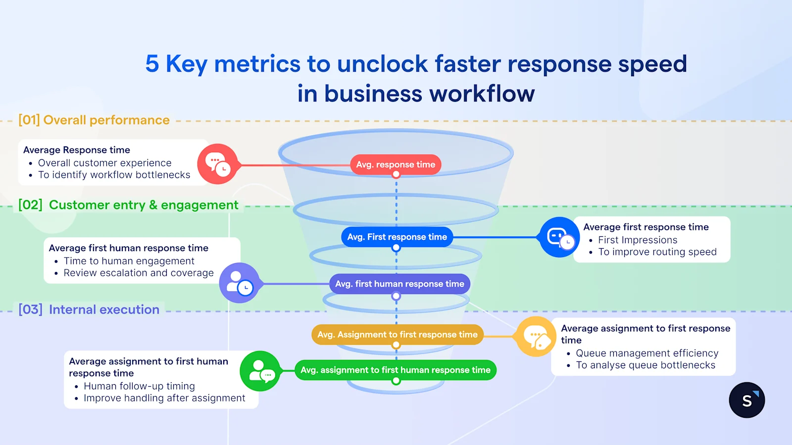
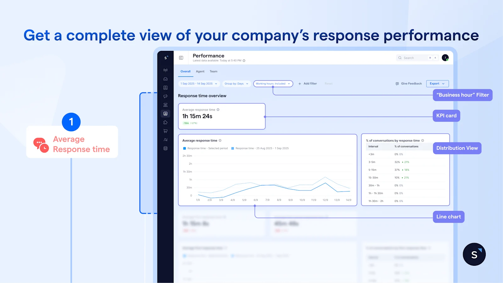
The Average response time KPI card is your first checkpoint. If it’s stable or improving, things are under control. However, when it starts trending upward, that’s when you need to take a closer look, before it turns into an SLA issue.
The line chart adds context. A short spike usually reflects a temporary surge in demand, while a sustained upward trend points to something structural which needs to be further investigated.
You can use the “business hour” filter to evaluate your team fairly based only on their active shifts. If the spike disappears when filtered, it is outside-hours demand that an AI agent can handle. If it remains during working hours, you know the issue truly sits within your team's workflow.
Even so, averages alone don’t tell the full story–it can still mask poor experiences for a significant portion of customers. The distribution view shows how response times are actually spread. For instance, a 30-minute average can mask the fact that 40% of conversations waited over an hour. This is where you move beyond a single number and define realistic benchmarks.
To go further, you need to understand how fast is the new conversations are picked up.
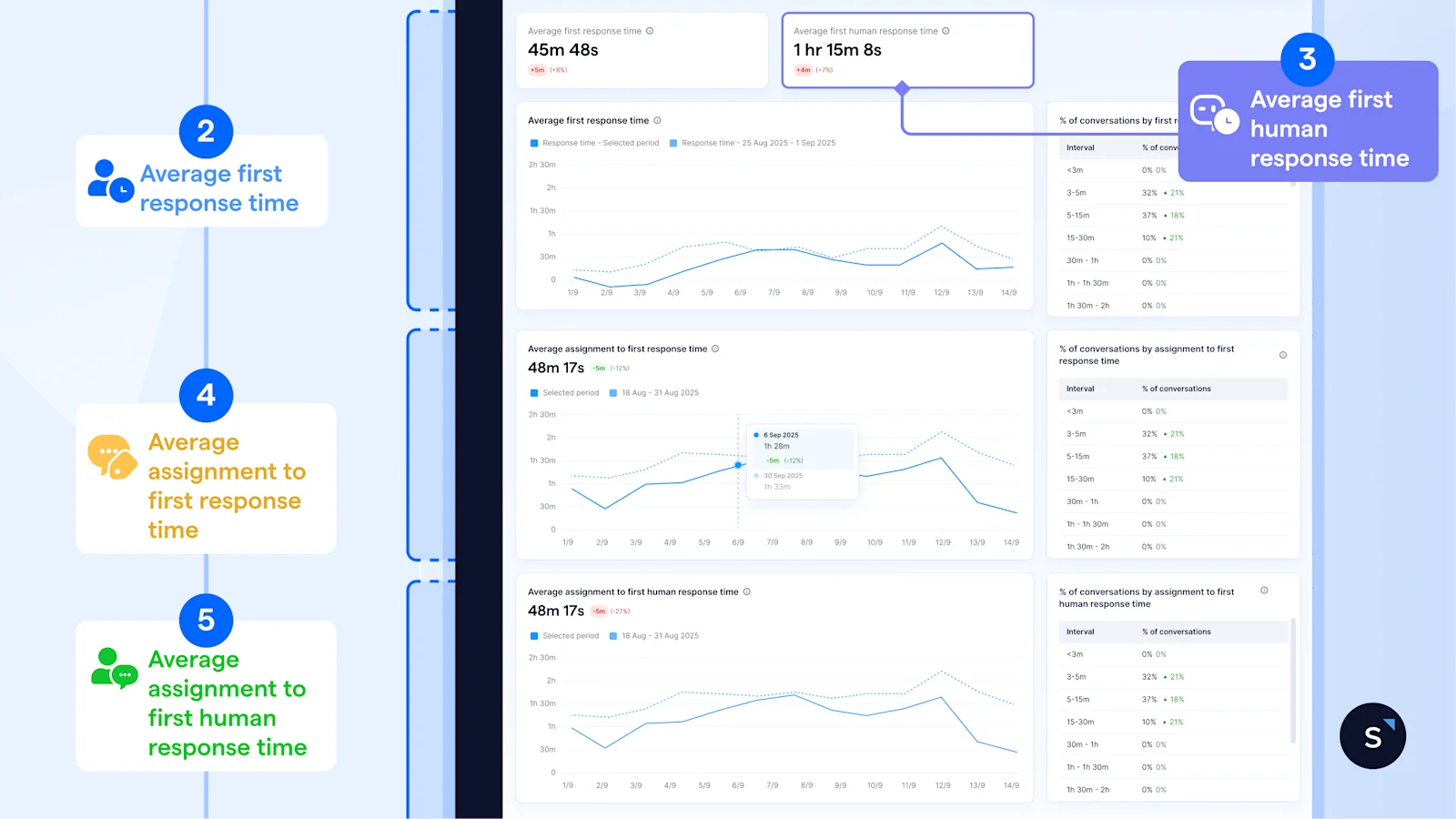
By comparing the KPI cards of Average first response time and Average first human response time, the gap suggests how long a conversation remains in AI/automated handling before a human steps in.
A widening gap isn't always a bottleneck; it could signal that your AI is doing the "heavy lifting"—qualifying leads and gathering context before the handoff.
A narrow gap may indicate underutilized automation, but in high-intent or priority scenarios, it can also reflect the right behavior—getting customers to a human as quickly as possible.
The key is not the size of the gap itself, but whether the time before human engagement is adding value or introducing unnecessary delay.
Pinpointing the friction
While averages give you the "big picture," the trend graphs tell you exactly where your workflow is stalling:
Don’t let averages hide poor experiences. Leverage the distribution tables alongside each chart to see how conversations are actually spread across time ranges — and identify how many customers are sitting in the longer buckets that your averages are smoothing over.
1.2 Measure whether conversations are closing — and how efficiently
Responding quickly is only half the picture. The second half of the Overall tab shifts the focus to outcomes—giving you a clear view of resolution efficiency across all conversations. So, you can see where work is stalling and whether your team is actually helping customers resolve their issues
Resolution metrics only work if your team follows a consistent definition of “closed.”
Without that, differences in numbers reflect process inconsistency—not actual performance.
There are four metrics to watch at:
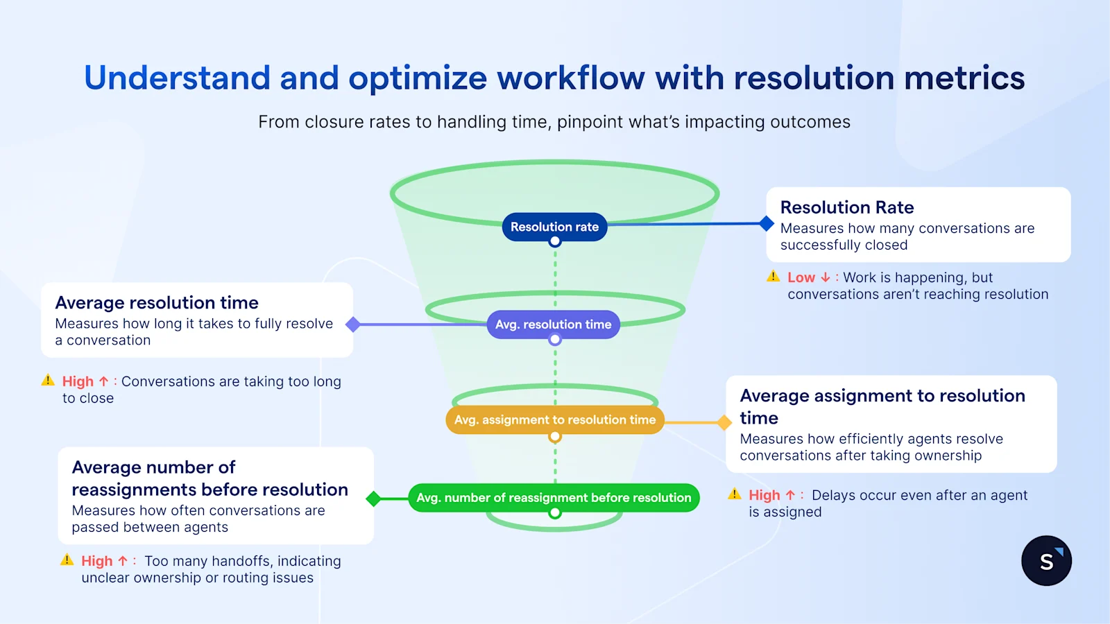
At a glance, the KPI cards under Resolution time overview reveal a complete picture and tell you whether conversations are being closed efficiently:
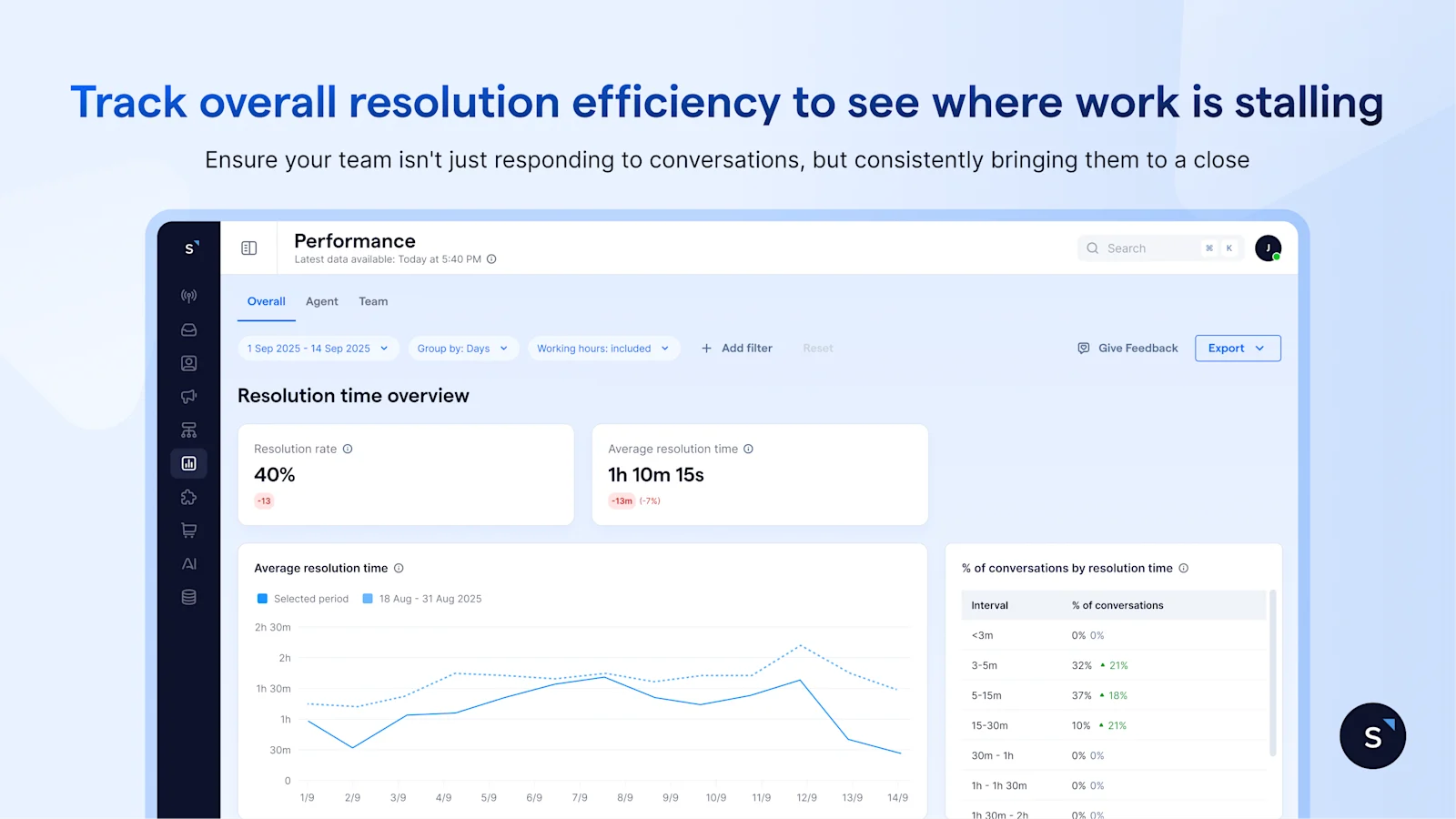
If the resolution rate drops, fewer conversations are reaching closure
If the resolution rate holds but average resolution time increases, conversations are being completed—but taking longer than before
To break this down further, the trend graphs reveal where delays are building:
Average resolution time trending up — conversations are taking longer to close overall. Check whether reassignments or handling inefficiency are contributing
Average assignment to resolution time rising — the delay is happening post-assignment. Agents are slower from the point they receive a conversation to when they resolve it
Average Number of Reassignments Before resolution rising — too many handoffs before closure. This typically points to routing gaps, ownership issues, or the need for specialist handling
That said, averages can hide what’s really happening underneath. A higher percentage of conversations resolved within different time intervals may be driven by a subset of conversations that take significantly longer to close.
To go one step deeper, filter by label. For example, if conversations labelled as technical issues consistently take longer to resolve, this may indicate the need for dedicated routing or specialist support.
2. Compare team performance and capacity across the organization
Once you have a company-wide baseline, the next step is to understand how performance differs across teams—and where imbalances are beginning to build.
Rather than looking at each team in isolation, the Team tab brings them together in one place, allowing you to compare workload and performance side by side and make resourcing decisions with confidence.
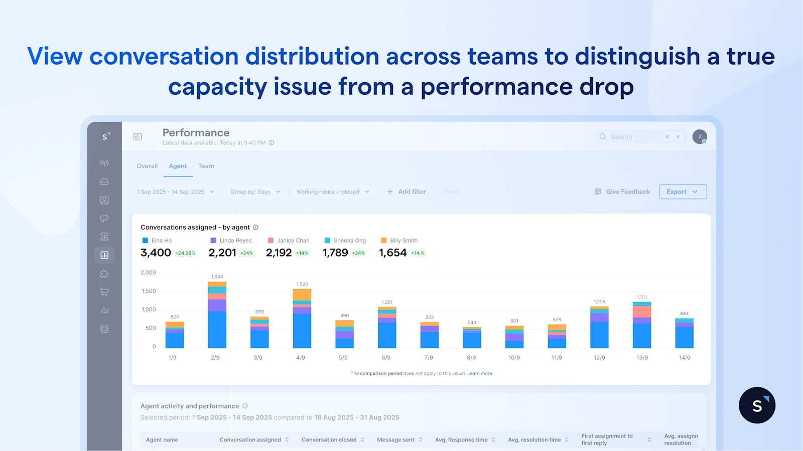
The bar chart shows how conversations are distributed across teams, making it immediately clear whether the workload is balanced. This context is critical. If one team is handling significantly more conversations than the others on the same channels, any slowdown in response time should be interpreted as a capacity issue rather than a performance issue.
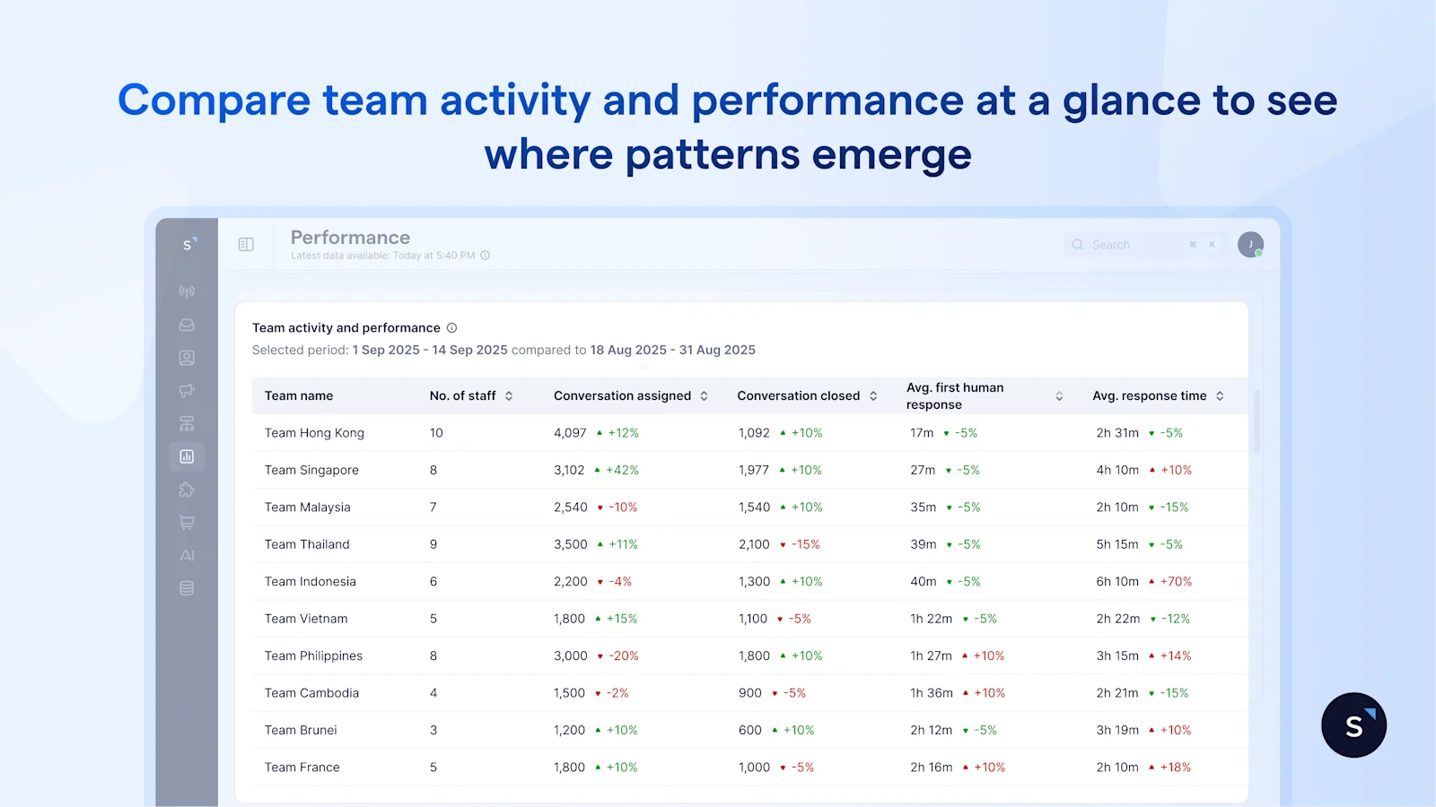
For a faster read, the activity and performance table brings everything into a single view. You can compare teams across size, conversation volume, response time, and resolution at a glance—where patterns often become clear.
For example, if Team A is handling twice the conversation volume of Team B but maintaining similar response times, it suggests the team is operating efficiently under higher load—though this may not be sustainable over time.
On the other hand, if two teams are handling comparable volumes but one consistently shows slower response or resolution, the issue is likely internal—whether in workflow, routing, or queue management.
The Team tab helps you focus on a few critical questions:
Are certain teams carrying more than their fair share of workload? If so, rebalancing early can prevent performance from slipping.
Is a slowdown driven by demand or by inefficiency? Distinguishing between the two ensures you address the right problem—whether that’s adding capacity or improving processes.
And finally, are you set up to scale? With a clear view of how teams perform under different workloads, you can make staffing decisions based on evidence rather than instinct—and track whether those decisions actually improve performance.
3. Compare individual performance to identify top performers and guide coaching
Once you’ve identified patterns at the team level, the next step is to see how they show up at the individual level. The Agent tab brings this into focus—so you can assess performance across agents and turn insights into action.
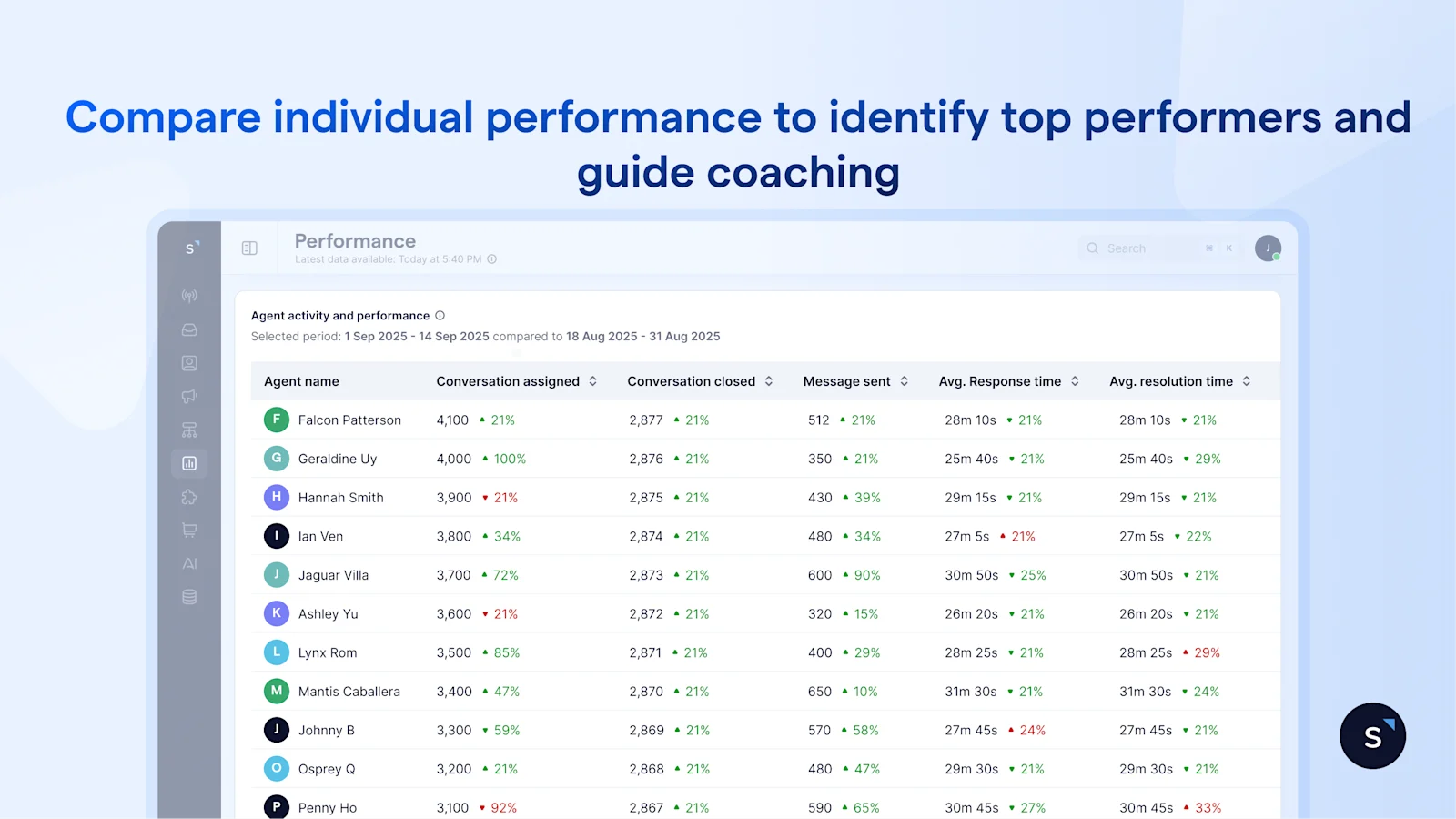
At this level, the goal isn’t just comparison—it’s clarity.
By looking at individual metrics in context, you can see who is consistently handling high volumes while maintaining strong response and resolution times—and who may be struggling to keep up.
This is where the data becomes useful for day-to-day management. For example, an agent who handles a high number of conversations with stable response and resolution times sets a clear benchmark for the team.
At the same time, if another agent shows a slower response after assignment but performs well once engaged, the issue may lie in queue management rather than responsiveness. That distinction allows you to coach more effectively.
Because all metrics are standardized, performance comparisons are fair. Instead of relying on general impressions, managers can evaluate agents using consistent data, making performance reviews more objective and easier to justify.
Over time, this helps close individual performance gaps before they impact customer experience. Rather than reacting to issues after they surface, you can identify where support is needed early—and guide improvement with clarity.
The benefits of using the SleekFlow performance analytics dashboard
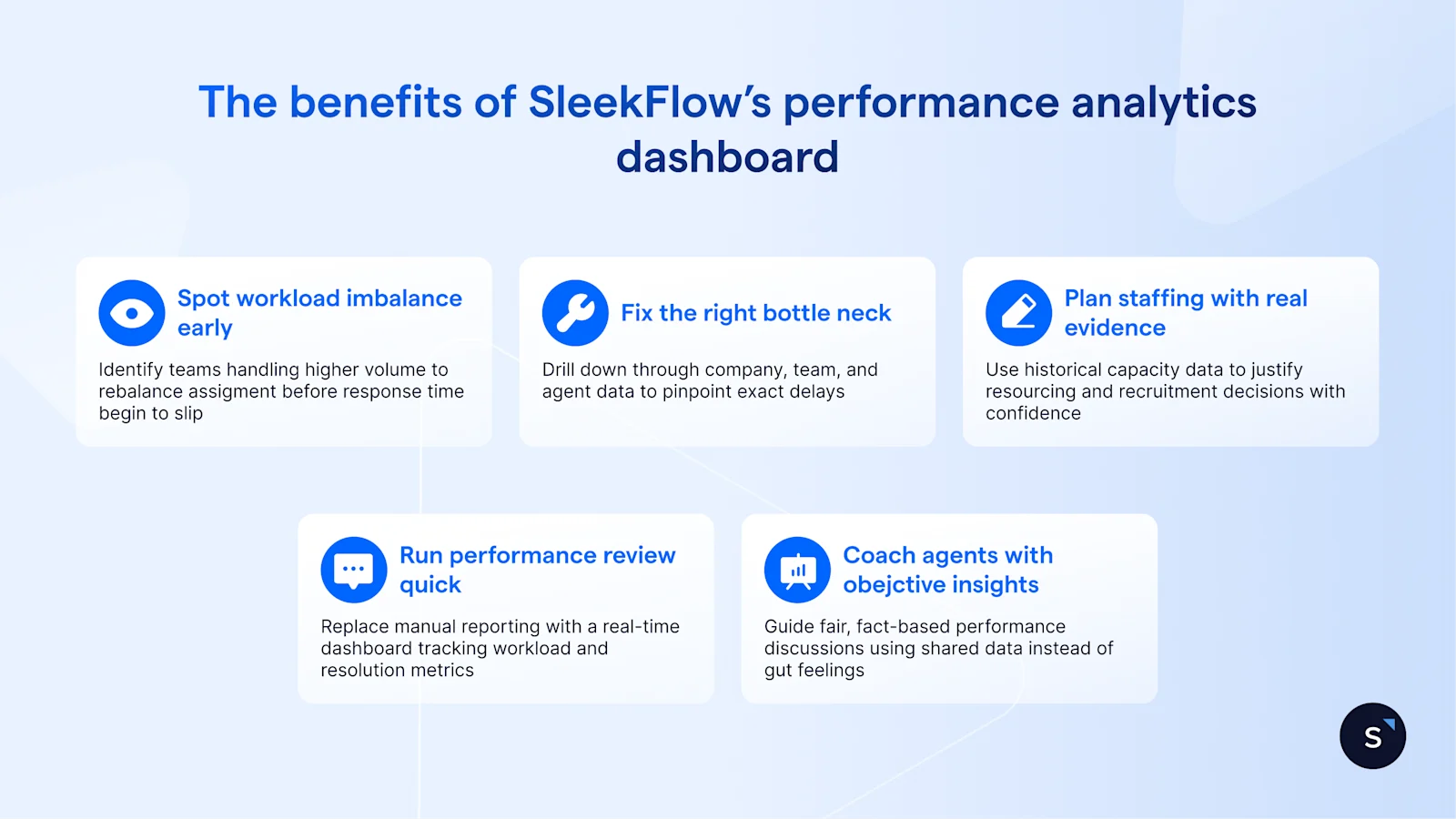
Spot workload imbalances before performance drops — Identify when certain teams or agents are handling significantly more conversations and rebalance assignments before response times slip.
Fix the right bottleneck, not just the most visible one — Drill down from company → team → agent performance to pinpoint exactly where delays occur across response times, assignments, and resolutions and act with precision
Plan staffing and training with real capacity data — walk into every resourcing conversation with evidence.
Run weekly performance reviews in minutes, not hours —Replace manual reporting with a real-time dashboard that instantly shows response times, workload, and resolution metrics.
Coach agents with objective insights — Use shared performance data to guide fair, fact-based performance discussions instead of relying on gut feel.
Start for free!
Grow your revenue and turn chats into conversions with AI agents. Try SleekFlow for free, forever.


